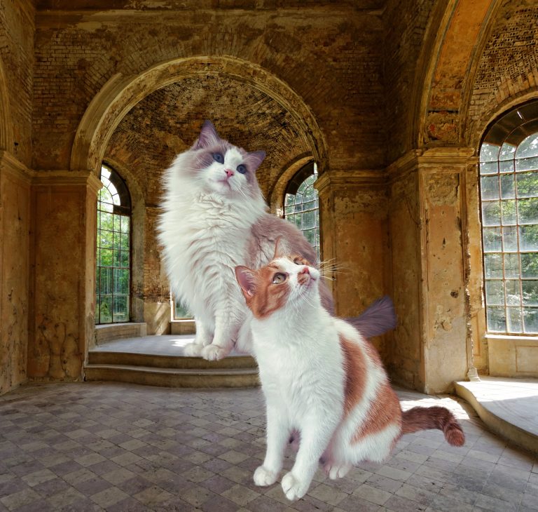
Understanding how cats see the world is more than a curiosity; as their more capable companions, we have a responsibility to try to see the world as they do. What colors fill their vision, and how might they feel about them? This understanding allows us to choose objects that genuinely resonate with them, creating a space where they feel truly at home.
How Cats See Colors
Cats, like many animals, don’t see the full spectrum of colors that humans do. Their two types of cones are sensitive to blue and green wavelengths, creating a limited palette of soft blues, greens, and some muted yellows. Colors like red and pink, which we often associate with warmth, simply don’t register for them in the same way—they appear as shades of gray.
This unique color perception makes a cat’s view of the world softer, quieter, and less vibrant. There’s no sharp contrast between a red toy and a green carpet for them, nor do they see the burst of warm colors in a sunset. Instead, their view is a tranquil landscape with fewer contrasts and gentler hues.
Monet’s Late Paintings: An Analog for Cat Vision
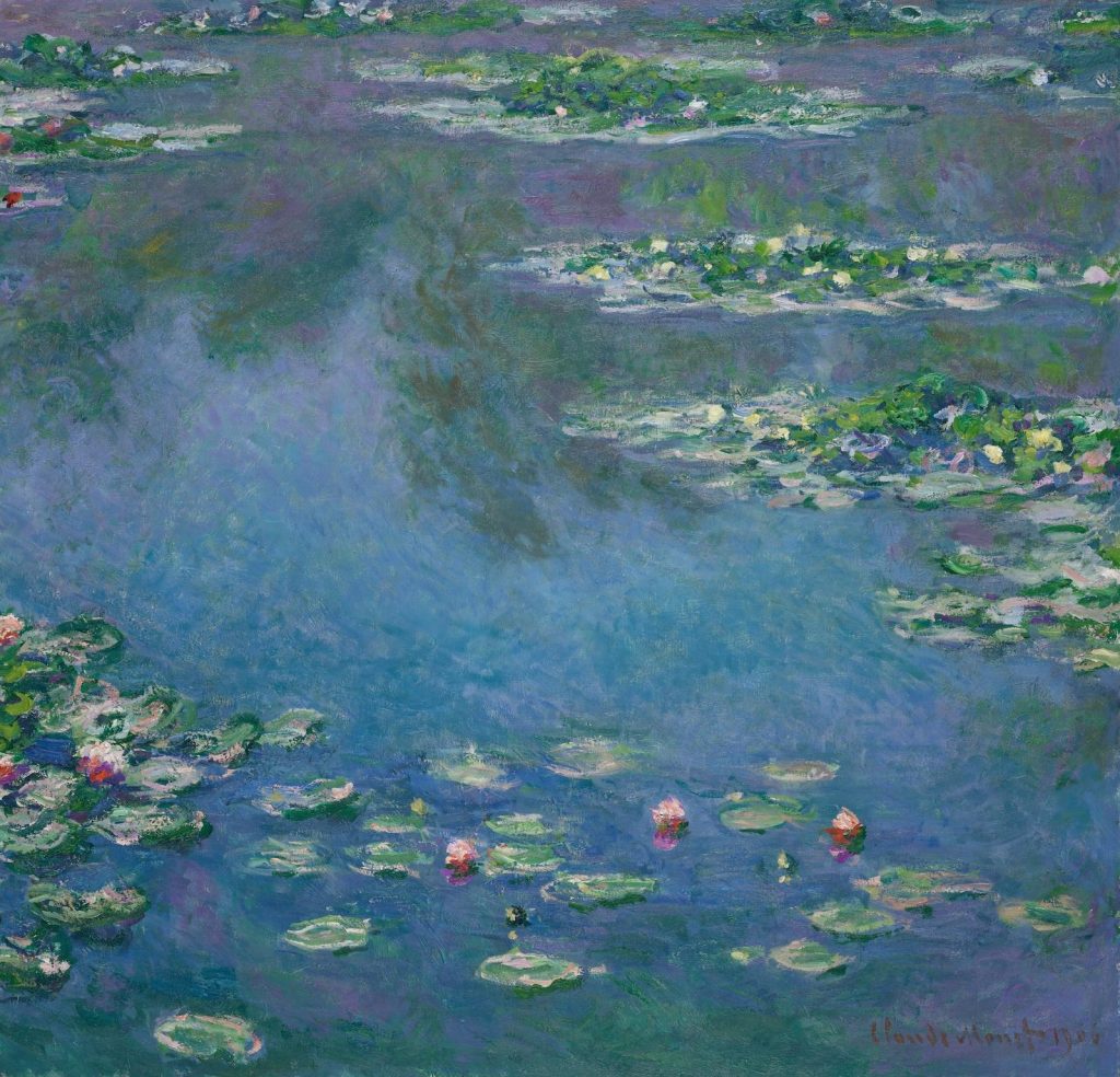
This muted perspective brings to mind the later works of Claude Monet, created when his deteriorating eyesight transformed his world. Monet developed cataracts, which clouded his vision and softened his once-brilliant palette. As a result, his paintings shifted toward ethereal blues, misty greens, and gentle yellows. Strong reds and vibrant hues all but disappeared, leaving a world not unlike what our feline companions might experience.
And yet, Monet’s vision of a limited, softened world gifted us with an entirely new aesthetic—one that is moving, serene, and poetic. The blue-greens and softened hues in his late work resonate with a quiet grace, suggesting that even in a world without the full spectrum of colors, there can be beauty that touches the soul. Imagine how marvelous it would be if our homes could evoke a similar tranquility, a space where cats feel as if they’re wandering through Monet’s “Water Lilies” series. If your living room held the gentle blues and greens of Monet’s grand canvases at the Musée de l’Orangerie, it would be a realm of understated warmth, uniquely suited to feline eyes.
Designing with Feline Vision in Mind
As a designer, knowing how cats perceive color can guide every decision in creating spaces and products for them. For our human eyes, colors like red, pink, and orange naturally evoke warmth and comfort. But for cats, blues and greens—colors that they can distinguish—become their “warm” tones. Rather than filling our homes with bright reds or pinks that may appear dull to cats, we can embrace a softer palette that resonates with their vision. Cat beds, blankets, or toys in muted greens and blues could be far more inviting for them.
In winter, while we wrap our spaces in festive reds and golds to chase away the cold, it’s worth remembering that warmth looks different for our feline friends. For them, a cozy blue blanket can be just as comforting as a red one is for us.
Creating a Cat-Centric World
Reflecting on Monet’s artwork has deepened my understanding of the world through feline eyes. His palette, born from physical limitation, revealed a new form of beauty, a beauty that also lives in the limited color world of cats. Inspired by this, I feel a renewed dedication to creating a “cat-centric” space, one that harmonizes with their unique vision.
This understanding of their perspective isn’t merely a scientific insight—it’s a gesture of love. Beauty doesn’t require every color, and I want my cats to be enchanted by the brightest sights they can perceive.